
On April 21st 2015, the mobile-friendliness of a website became another ranking factor on Google. “Mobile-friendly” looks at the usability of a website on a smartphone. The algorithm update therefore only affected mobile search requests, in all languages worldwide.
- Mobile friendly ranking update announced in April 2015
- Why has the mobile-friendliness become a ranking factor on Google?
- What does Google consider to be a mobile device?
- Does Google have its own smartphone search-index?
- Gary Illyes on Google's search index:
- What are the criteria for a mobile-friendly website?
- Keep in mind: Responsive design ≠ mobile-friendly
- How are mobile-friendly websites labelled?
- Find information on un-optimised pages in the Google Search Console
- Check your own smartphone Visibility Index
- Video on the subject: Basics of a mobile website for SMBs
- Further information on the subject
Mobile friendly ranking update announced in April 2015
Starting April 21, we will be expanding our use of mobile-friendliness as a ranking signal. This change will affect mobile searches in all languages worldwide and will have a significant impact in our search results. Consequently, users will find it easier to get relevant, high quality search results that are optimized for their devices.
– Google Webmaster Central Blog, 26.02.2015
That means: If the contents of a domain are not “mobile-friendly”, meaning they are not optimised for mobile devices, they can be at a disadvantage for smartphone searches. Google also makes the mobile-friendliness of a URL visible in the search result pages and warns users about unoptimised content on mobile searches.
Why has the mobile-friendliness become a ranking factor on Google?
In 2014, the search traffic searches using only mobile phones started to exceed 20% in Germany.
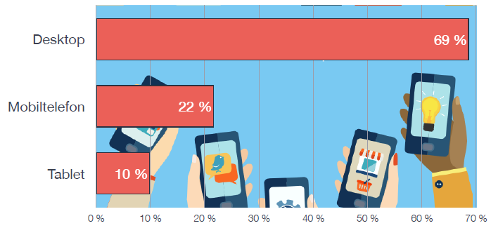
This data comes from Webtrekk Deutsche Webstatistik 4. Quartal 2014 (German web-statistics, 4th quarter 2014. Source page no longer available).
As a search engine, Google wants to deliver the best result for the search requests and situations of each and every user. By checking a website for its mobile-friendliness, it can be guaranteed that the mobile searcher can fully access and consume the information on the page.
If a website offers the best information for the user searching on a mobile phone, the content is only useful if the website can be fully used on a mobile device. If the content is not mobile-friendly at that time, then the site cannot be the most fitting result for the situation the user is in, at the moment.
Obviously, Google realised this and even expected mobile searches to surpass desktop searches at the time of the update:
Expect Google’s mobile traffic to exceed desktop traffic in the very near term.
– Matt Cutts in June 2014 at the SMX
This milestone came about in May of 2015, when Google wrote that in more than 10 countries, including the US, more searches took place on mobile devices than on desktop.
What does Google consider to be a mobile device?
When a user starts a Google search on their mobile device, the advantage of having a “mobile-friendly” website cannot be denied. Google separates mobile devices into four device-categories:
- Smartphones: for example Android-devices, iPhone, or Windows Phones
- Tablets: Google treats these mobile devices more like a desktop computer
- Multimedia-Phones: these do not support all HTML5-standards
- Feature-Phones: these do support standard HTML
Google primarily defines smartphones as a “mobile device”, less so Tablets and Feature-Phones.
Does Google have its own smartphone search-index?
No. There is only one Google index. Indexation and ranking of a website work as follows:

For a search request, the search engine Google differentiates between a smartphone search and a desktop search. The results on the search result pages come from the same search index in both cases. Depending on the device used, a different URL may be displayed as a result.
Gary Illyes on Google’s search index:
Google employee Gary Illyes made it clear on Twitter that Google only has one search index.
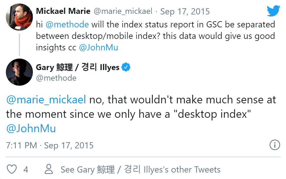
In Google’s search index, all characteristics of a URL are documented. This includes whether the URL is optimised for mobile devices or not. For the ranking of a page it does not matter whether the mobile friendliness is achieved by using a so-called responsive design or an independent website optimised for mobile devices.
What are the criteria for a mobile-friendly website?
Google checks each URL individually, whether the content on the page is “mobile-friendly” or not. If a page has been optimised for smartphone use, the Google Bot will recognise this during the crawl and immediately take this factor into consideration. This happens almost in real-time.
While Google recommends using a responsive design, you will not be at a disadvantage if you have your mobile-friendly designed content on a specific hostname (for example http://m.domain.com/) or your own mobile website (for example http://domain.mobi/).
The following four criteria are crucial for mobile-friendly websites:
- Avoid uncommon software on mobile devices, like Flash
- The text can be read without zooming in
- The content size adapts to the screen size, so that users do not have to scroll or zoom in horizontally
- There is enough room between links for users to tap on the desired link without problems
Webmasters can use Google’s own tool to check if a URL is optimised for mobile devices. This will also show you suggestions on how to improve the user friendliness on mobile devices.
Keep in mind: Responsive design ≠ mobile-friendly
Google already announced the proper configuration of mobile websites as being a ranking factor for search results on Smartphones in mid 2013.
A so-called responsive webdesign is only a (partial) means to an end. Next to the proper scaling of the design on various mobile devices, as well as the changed arrangement of elements on the website, it also depends on other technical properties to really be “mobile-friendly”.
Next to the four criteria for mobile-friendly websites, you have to make sure that, for example, JavaScript, CSS and image files are not blocked for the crawl. Incorrect redirects or missing notices on where to find the mobile-friendly content, for example on http://m.domain.com/directory/content.html, are just as important to Google as the PageSpeed optimisation of individual pages.
Oftentimes, the above points are not covered by simply using “responsive design”. This means that, just because you have made sure that the page layout looks fine on a smartphone, it does not necessarily mean your content is thoroughly mobile-friendly.
- Check out Google’s guideline for mobile devices: Common mistakes
How are mobile-friendly websites labelled?
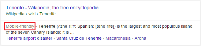
In the mobile search results, Google shows a “Mobile-friendly” label for every applicable URL to mark the mobile friendliness of the search result.
Once Google crawls a page anew, after April 21st 2015, all the optimisation you put into the increase of mobile friendliness becomes effective immediately for the mobile ranking of the URL.
If the functionality of a website is gravely disrupted or if content is unreachable, the search result will receive a noticeable label in the mobile SERPs.

If a website uses Flash, for example, it may not be usable for a smartphone user. Google will already warn you about this on the search result pages and complicate getting to this page by making the otherwise blue and clickable Title-element contain no link. If you really want to open this page, you will have to click on “Try anyway” first.
Find information on un-optimised pages in the Google Search Console
In the free Google Search Console, which should be used by every website operator, by the way, you are shown information on the user friendliness of your own website on mobile devices. Many webmasters have already gotten a message from Google, if there were any problems with the mobile friendliness of specific pages.
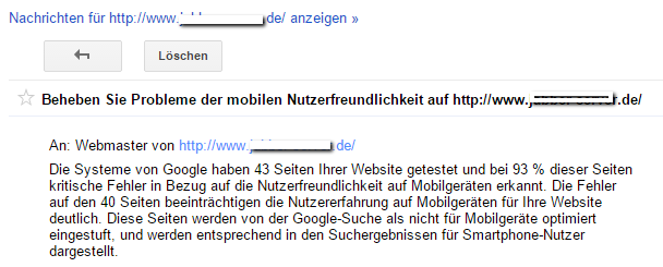
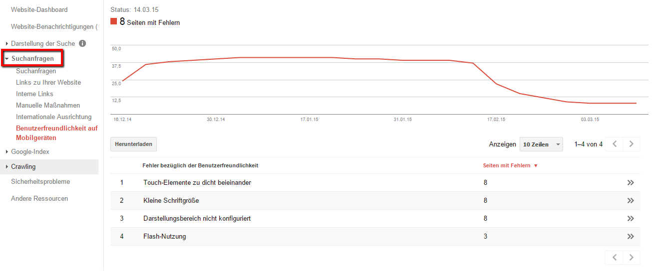
These specific URLs, which Google identified, are not yet considered to be mobile-friendly and should be optimised accordingly. You will find a list with criteria you should work on, by going to >Searchrequests< in the Search Console:
Check your own smartphone Visibility Index
How much of an effect do the ranking factors of the mobile-friendly updates already have on the mobile search rankings and how will they influence the rankings in the future? We came up with the SISTRIX smartphone Visibility Index for you to evaluate exactly these questions. You can directly compare the desktop- and smartphone-Visibility for domains and thereby notice weaknesses in the configuration and usability of your mobile websites.
Please see our tutorial “Evaluating the Visibility Index for Smartphones” for more information.
Video on the subject: Basics of a mobile website for SMBs
Learn the correct configurations, go-to tools and optimization strategies to make a big impact on both your customers and search engines.
Further information on the subject
Sources and information directly from Google:
- Blog: Helping users find mobile-friendly pages
- Blog: Finding more mobile-friendly search results
- Developer Guideline: Mobile Friendly Websites
- Tool: Test the optimisation for mobile devices
Sources and information from SISTRIX: