(Translation of our German Blogpost from June 6th, 2017)
A lot of companies and organizations have very fancy websites, which sadly miss the mark. Many times they are nothing more than a digitalized, glossy company brochure. To some this may actually sound great. Though sadly, company brochures are usually some of the most boring things in the world. Pure advertisements which very few people want to share online without monetary incentives. I would like to use the website for Recaro as an example – especially their main navigation. The company is most well known for their car- and child-safety seats.
If you are interested in their products and search Google for Recaro, you will find the domain http://en.recaro.com/ as the first result.
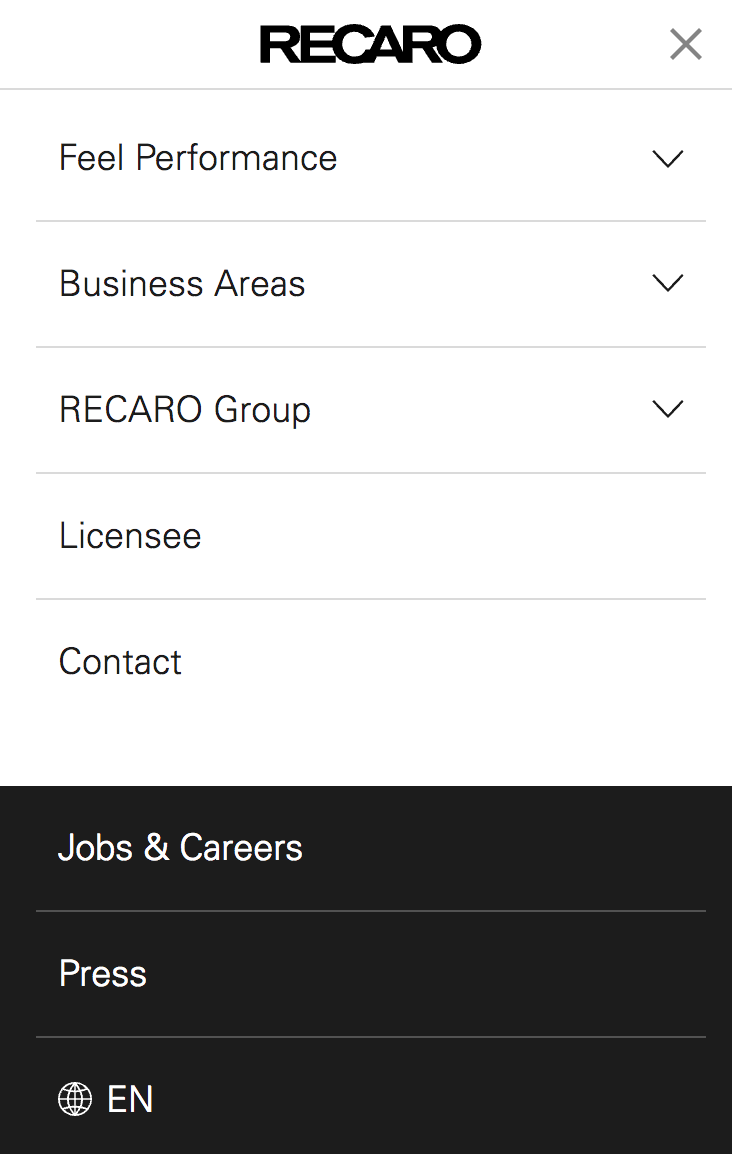
Their main navigation is made up of five menu items, “Feel Performance”, “Business Areas”, “RECARO Group”, “Licensee” and “Contact”.
What am I, as a user, supposed to click on if I am interested in a new car seat?
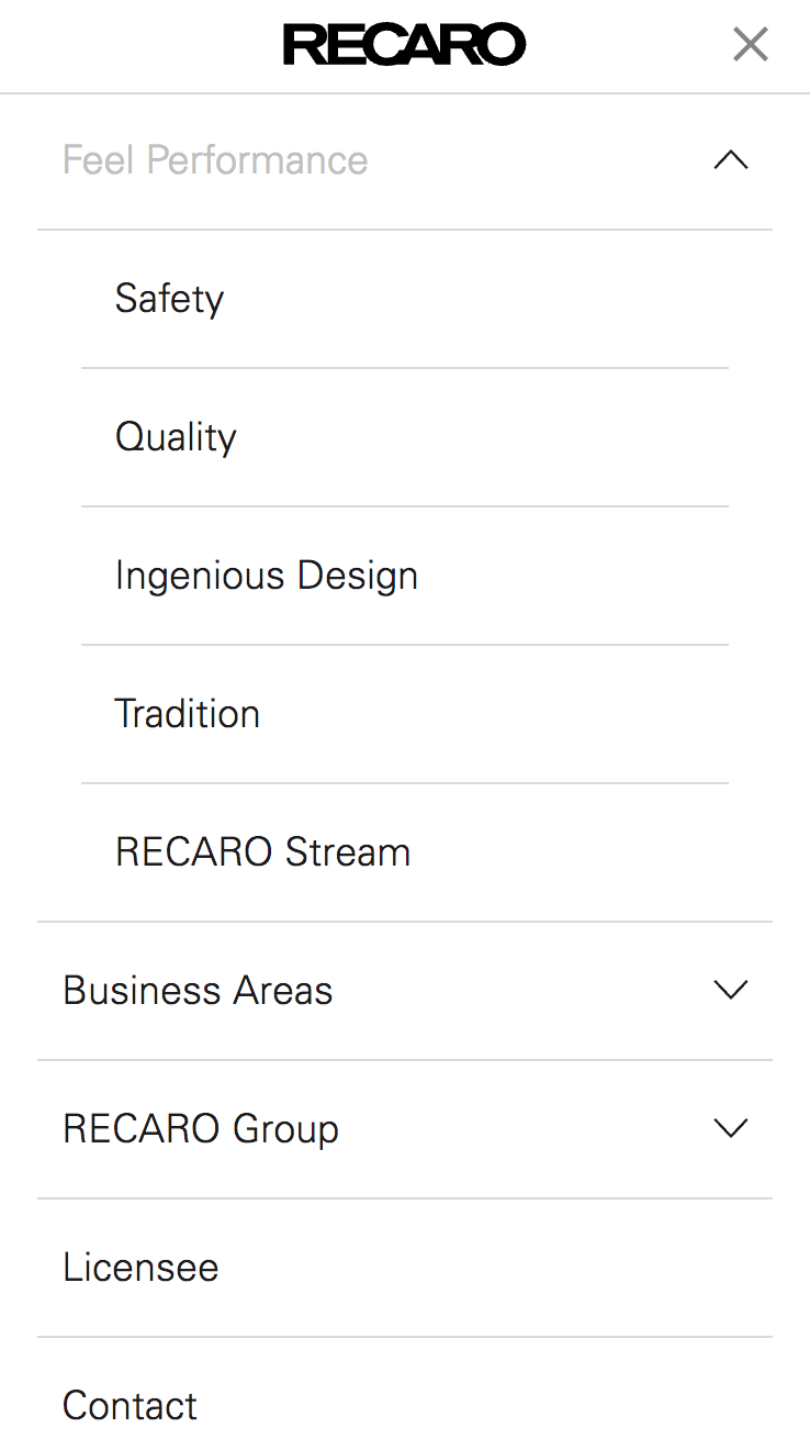
The second navigational level then has the items, “Safety”, “Quality”, “Ingenious Design”, “Tradition” and “RECARO Stream”. Also not really helpful when looking for car seats.
The Insider View Is The Wrong Perspective When Creating Websites
The navigation for Recaro is a pure insider view into the company. The internal organization is recreated in the form of unique selling propositons, the strategic business portfolio and partner companies.
These are not the categories in which users think. An end consumer will feel lost on the website and even Google is unable to do much with the (key)words in the navigation – which send a strong signal with their link texts. Google is still mostly a text based seachengine and internal links are of great importance as a ranking factor. In the case of Recaro, they are sending Google the signal that the website is a fitting result for “Business Areas”, “Safety” or “Tradition”. Google users asking these questions are very likely to want other websites than one for car safety seats as their results. This makes it hard for Google to find useful rankings for this website.
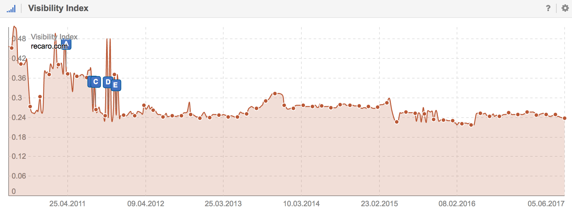
Because of this, the website ranks mostly for keywords that have brand mentions, such as “recaro seats”, but not for such generic terms as “car seats” (without the brand mention). It is really not a surprise that recaro.com only manages a modest Visibility Index value of 0,2384. If we look at the trend for their Visibility values we see that they are stuck in a monotonous sideways-trend since 2011. Their brand keyword rankings are safe and stable. For all additional keywords the website is out of the question, simply due to how they structured they main navigation.
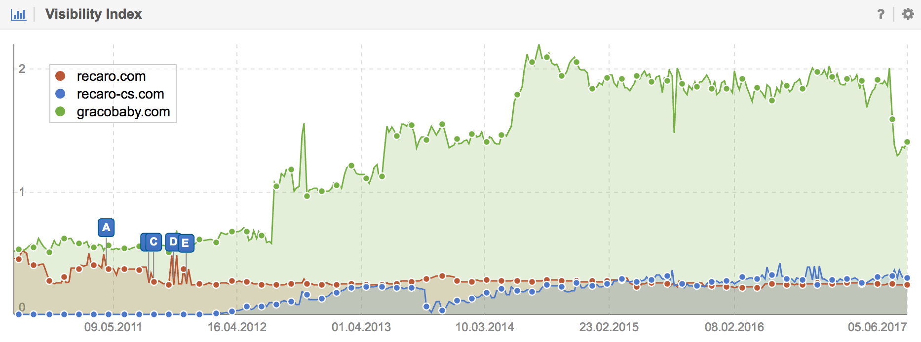
To be fair, I do need to mention that the two business areas of car and child-safety seats have two more webites with recaro-automotive.com (Visibilit Index of 0,1987) and recaro-cs.com (Visiblity Index of 0,2985). But even this segmentation into multiple domains is not necessarily in the best interest of users. There is a high probability that a user will land on the wrong domain and feel left out. The following chart shows how competitors, such as gracobaby.com (Visibility Index of 1,41), manage to get a multitude of Visibility on Google.
A Customercentric Website Starts With a Customercentric Navigation
Jens Fauldrath shared a quick and easy test that each and every company should run on their site.
If I am able to identify my internal organisation through my main navigation, then it is always wrong.
– Jens Fauldrath
We get an additional idea for a blind test from Astrid Kramer. Show a test subject only the main navigation for your website and hide the rest of the page. Will that person be able to say what kind of company or store the website belongs to, just by looking at the main navigation? Or is there only “About us”, “Home”, “Contact” etc.?
Recaro’s website, as well as a perceive 90% of all company websites, would fail in this blind test. What SEOs and “Digital Companies” are taking for granted is something that traditional companies and organisations seem to struggle with in a major way. They do not walk in their users shoes, do not consider their needs, interests and language use. All they communicate are their internal views.
Don’t Make Me Think
Another vivid example is the website for the AMA. Will a user that does not know what the AMA is get a feeling for what they do, what they provide and what use they have, simply by looking through their navigation?
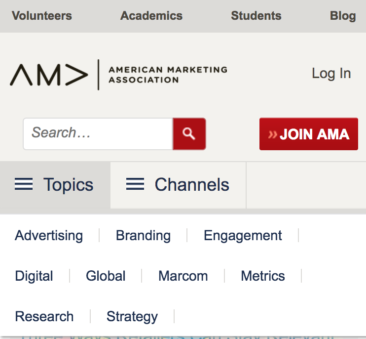
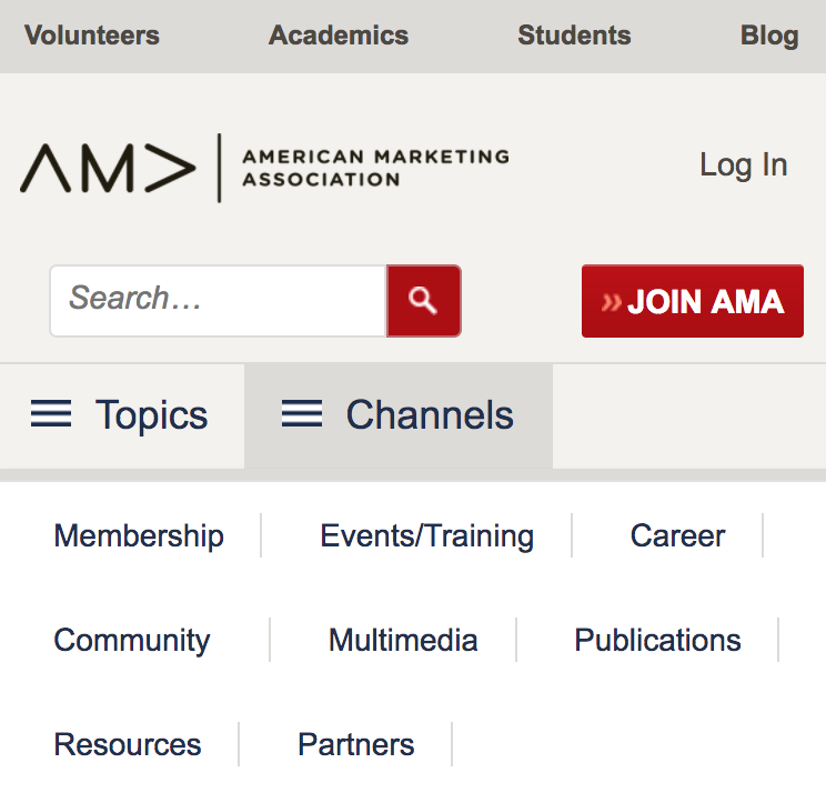
While the topics may give some idea what they offer, the channels is pretty much filled to the brim with their internal view of their organistion, again. Their target audience is interested in other information during their first encounter. And Google is also offered up the wrong signals.
The American Marketing Association is an association for marketing professionals who terms itself as the essential community for marketers. It would be great if a new generation of marketing managers got the chance to show traditional companies how modern marketing works and how to build user-oriented websites with suberb usability. The main directive for any intuitive website towards their users should always be “Don`t Make Me Think“.
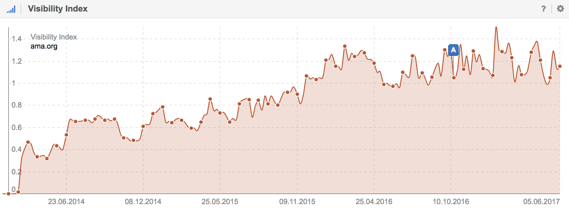
We can argue that the AMA might not be sending the best possible signals to Google. Looking at their Visibility, we see a rather wide sideways trend since 2015.
Customer Focus Is The Superior Competitive Edge
Today, we hear lots of talk about digital transformation. If you ask me, this term – and most discussions about it – miss the actual mark a bit. If you want to emulate such flagship companies as Google, Amazon, Netflix, Apple, Tesla etc. then your first agenda does not necessarily have to be to “make things digital”.
The first step should be customer- or rather user-orientation. These flagship companies all have in common that they are utterly consistent in how they focus their entire offers on their customers needs. That this often turns out digital offers is a logical consequence in our digital day and age.
50 Percent of Marketing Work Is Bringing Information Into The Company
Sucessful companies are not only using the digital world for the creation and placement of their services. They also use it to collect data on their customers, to communicate with their users, to understand them better and improve their services based on that collected knowledge and data. 50% of marketing is about carrying the companies offers to the market. The other 50% is made up of carrying information from the market into the company.
Customer Focus Beats Competitor Focus
When we talk about marketing we are also talking about market focus. An important part of this is the customer focus as well as the competitor focus. Of the two, customer focus beats competitor focus, hands down. If all you do is react to what your competition is doing, then the best you can become is as good as them. If you are consistently guided by your customers needs, on the other hand, then you can develop innovative offers and create a real competitive advantage. One company, for example, who follows this strategy to the letter is Amazon and the book “The Everything Store” by Amazon CEO Jeff Bezos is worth a read.
Nowhere on a website does a missing customer focus – and too much of a competitor focus – become as clear as with the main navigation. If everyone simply copies their navigation from others websites, instead of serving the needs of their users, we are left with menu items such as “About Us”, “Products”, “Board of Directors”, “Company History” and “Contact”.
The place I notice this most often is with hotels. Can anyone tell me which hotel, in which city, does this navigation belong to and what makes it special? Exactly my point.

Navigation menus like this are not an exception, but the rule. If you work with such a menu then it should not come as a surprise that customers think you are interchangeable with everyone else and will simply make their choice by the cheapest price.
Marketing Buzzwords Such As Content Marketing And Holistic Content Are Only Crutches
The current marketing buzzwords such as content marketing and holistic content are nothing more than crutches. Sadly, this will often lead to misunderstandings where the real core behind it all – the user orientation – will get lost in the fray.
When it comes to websites, user focus starts with the design of your main navigation and should then extend all the way across your entire offers. The sad truth is that most companies will already fail first challange, their main website navigation.