
In this guide, we’ll provide step-by-step assistance on how to use Google’s mobile-friendly website test, discuss how easy it is for users to use websites on mobile devices, and give you tips for creating a mobile-friendly website.
- How do I test my web pages for mobile friendliness?
- Advantages of Google’s Mobile-Friendly Test Tool
- Why Should Your Website be Mobile-Friendly?
- How do I Create a Mobile-Friendly page?
- Make Your Website Responsive
- Additional Tips to Make Your Website Mobile-Friendly
- Make Information Easy to Find
- Eliminate Pop-Ups and Text Blocking Ads
- Prioritise Website Speed
- Utilise Simple Website Design
- Use Large Font Sizes
- Closing Thoughts
Discover how SISTRIX can be used to improve your search marketing. 14 day free, no-commitment trial with all data and tools: Test SISTRIX for free
During the second quarter of 2020, mobile devices generated 51.53% of all website traffic worldwide. With mobile usability becoming increasingly important, Google launched their mobile-friendly website test tool back in 2014.
During 2021, Google upgraded its mobile-friendly tool, offering users the ability to test code as well as live URLs in the same way that the Googlebot would. This was great news for developers as it provided an opportunity to make sure their websites are mobile-friendly before they go live. Additionally, if a website fails the test, the code can be edited, and your site can be continuously re-tested until it’s given the green light.
How do I test my web pages for mobile friendliness?
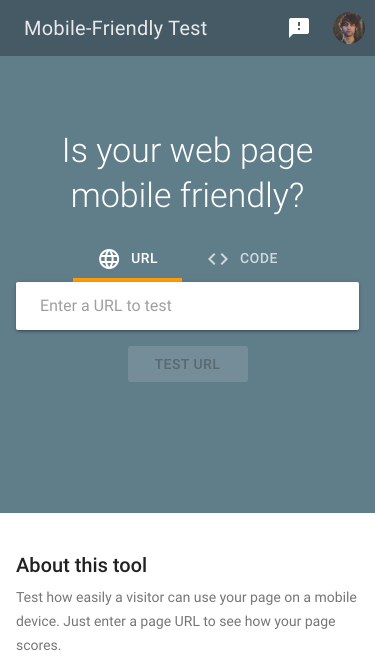
Although there are several free mobile-friendly test tools available on the internet, we recommend using Google’s for its simplicity, accessibility, and authenticity.
To access the tool, click here, or access the page via Google’s Search Console.
Related: What is Google Search Console and how to get Started
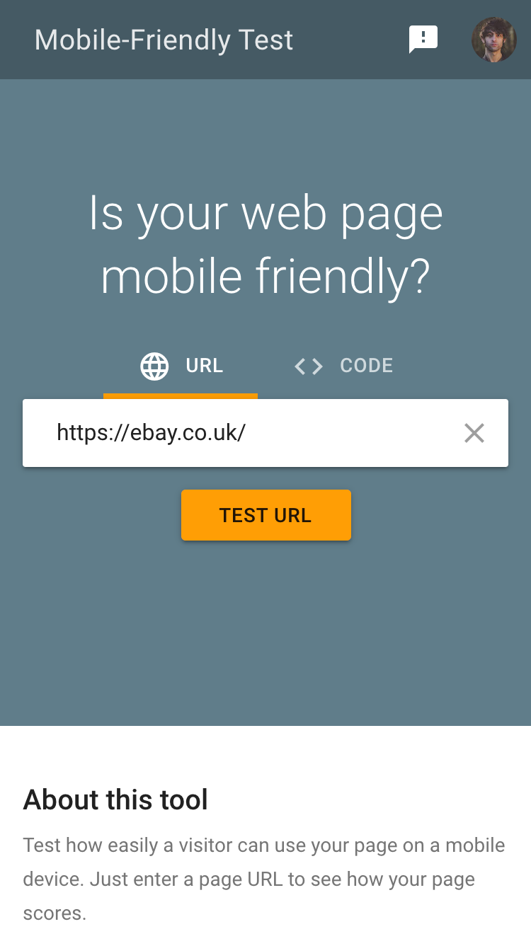
Using the tool is very straightforward, just copy and paste the URL of any page that you want to test and click ‘test URL’.
Within seconds, you’ll see a page similar to this one:
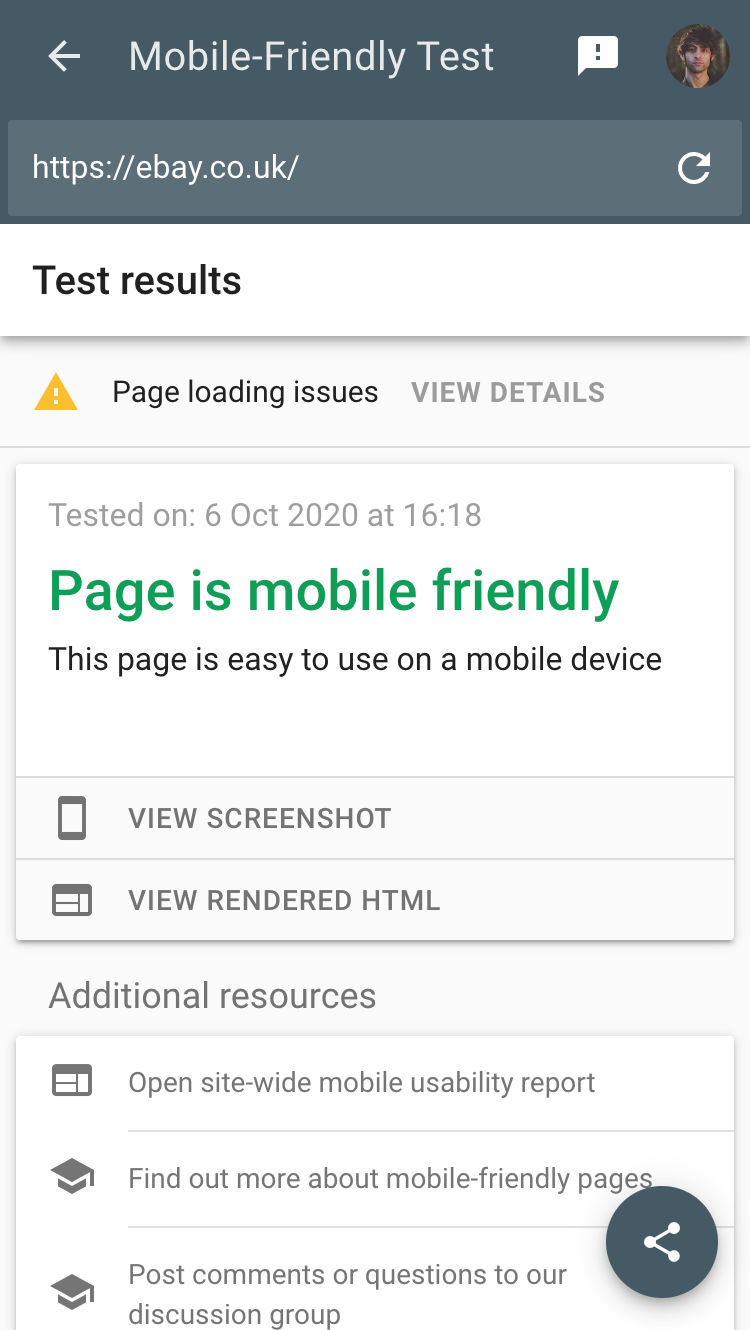
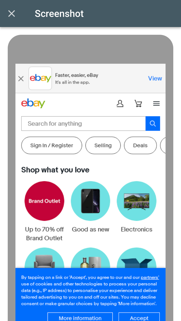
What’s more, You’ll be provided with a preview of exactly how the website will look when it is accessed on a mobile device and a site-wide usability report.
There is also an option to view the page’s source code, and the tool offers information on any usability errors that it encounters during the test.
For example, the test tool will inform you if your page is only able to load partially, and which elements failed to load on a mobile device. It can also highlight any CSS fonts that are unable to load, which is excellent from the perspective of troubleshooting. This is perfect for designers, developers, or businesses looking to make their website more mobile user-friendly.
Note that Google’s mobile-friendly test tool can be used to see if a site is blocking the Google crawler or offering Google different information to what the user sees (cloaking).
Advantages of Google’s Mobile-Friendly Test Tool
- Using this free tool, you can test a website that has already gone live or copy and paste a chunk of code. This offers an advantage to people working on websites that are still in development.
- Google provides instant answers to anyone trying to test whether or not their page is mobile-friendly.
- They also offer a list of ‘page loading errors’, explaining any loading issues that are impacting the website. This gives developers the information that they need to investigate and fix things and improve the usability of the website.
- The mobile-friendly test tool uses Google’s crawler agent I.D string, making it a ‘must’ for websites that want to perform well in Google’s search rankings.
Why Should Your Website be Mobile-Friendly?
In the U.S alone, people spend up to ten hours per day using their mobile phones. If your website provides an e-commerce service, or provides a payment system for any services, ensuring that the site is mobile-friendly means that you can reach a wider audience.
Next, you should be thinking about the user experience. Consumers and search engines alike consider UX to be critical when it comes to visiting and ranking a website. For example, if you want to rank on Google’s mobile index, your website must be mobile-friendly.
These days, nobody wants to have to pull and pinch at their mobile phone to view their shopping cart or access a product that they wish to purchase. Additionally, it’s incredibly frustrating when you accidentally click on the wrong link because you’re struggling to navigate on a non-mobile-friendly site.
Primary benefits such as user experience and improved reach rankings pave the path to secondary benefits like increased traffic and sales. When we combine all the advantages of mobile-friendly websites, we can consider tertiary benefits such as gaining traction against competitors and being perceived as innovative and future-ready.
How do I Create a Mobile-Friendly page?
Back in 2016, global mobile internet usage overtook desktop usage for the first time, with this trend steadily increasing ever since. There are many things that you can do to create a mobile-friendly web page, including, most notably:
Make Your Website Responsive
The majority of web design experts agree that creating a responsive website is vital to ensure that the site performs well across mobile and desktop platforms. Responsive websites provide similar content and information on all devices used to access them. However, the websites respond to the device used for access, optimizing their appearance accordingly.
Simply put, the way the website is arranged and displayed will adapt to suit the size of the screen used for access.
Responsive design allows website owners, developers, and designers to make their websites mobile-friendly without impacting t information available to mobile traffic. Mobile users access the same content as desktop visitors, automatically edited to enhance their user experience. Additionally, responsive design is great for SEO, with Google recommending this service on its official developer’s guide.
Additional Tips to Make Your Website Mobile-Friendly
Make Information Easy to Find
Use Google Analytics to find out what information your visitors spend the most time on when they reach your website and make sure this information is easy to access from the mobile homepage.
Additionally, you can investigate which FAQs are popular with your traffic and make sure that these questions are answered in a prominent position on your mobile homepage, or at least easy to find using a mobile device.
Eliminate Pop-Ups and Text Blocking Ads
Pop-ups are incredibly annoying on mobile devices and can force people to leave your website and never return. Suppose you are looking to create a fantastic user experience. In that case, you should disable any ads of pop-ups that block content for mobile users unless they are incredibly crucial to your business.
One way of keeping pop-ups without disrupting usability and getting in the way of content is to set the pop up to appear when people have scrolled to the bottom of your web page. Also, make sure that the ‘X’ to close the pop up is big enough to be viable and clickable on a mobile phone screen.
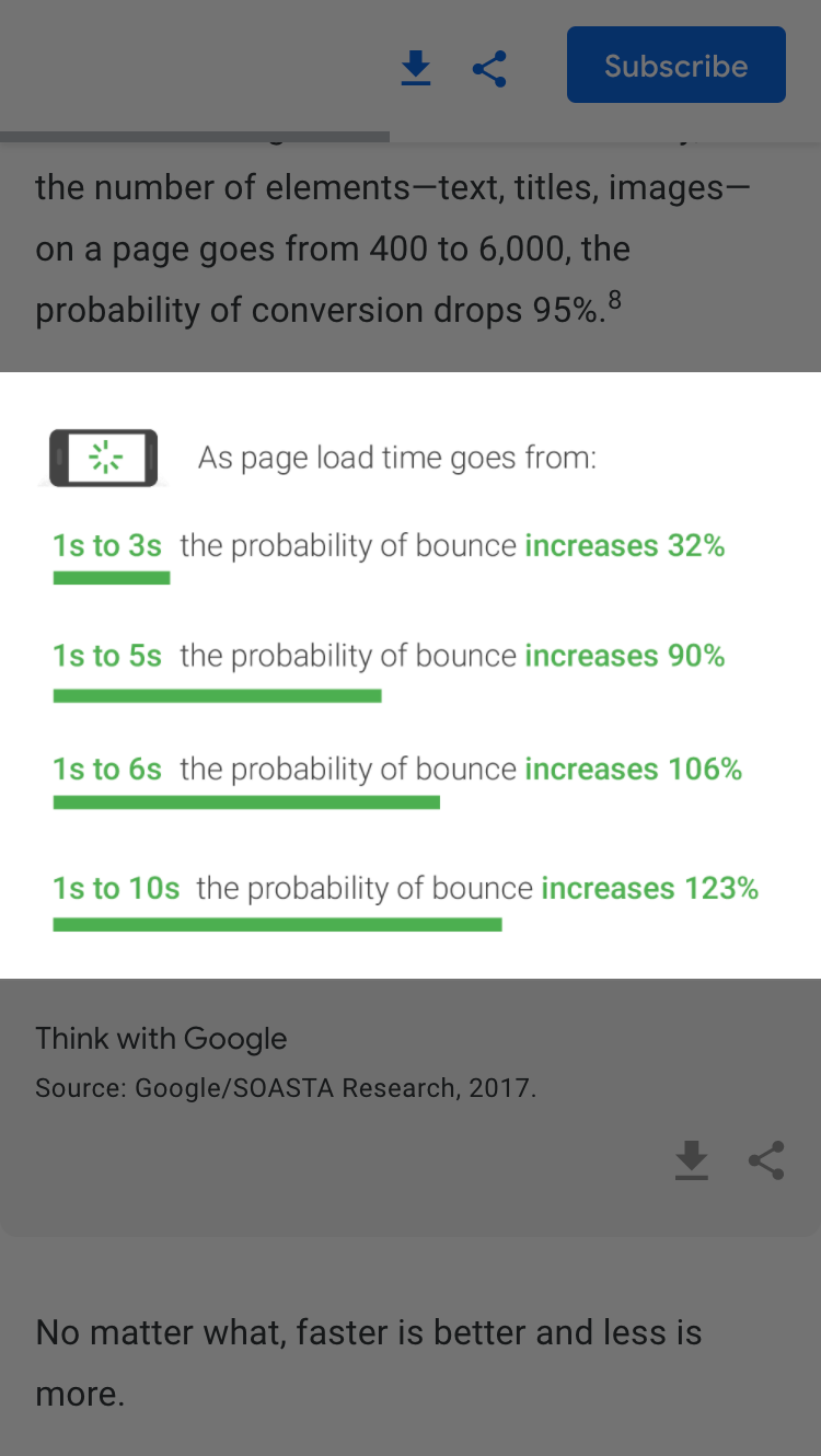
Prioritise Website Speed
With smartphones and tablets increasingly available and accessible across the globe, the average attention span of humans has dropped from twelve seconds to 8 seconds in the last twenty years.
This means that website speed has never been more important. You can use PageSpeed Insights in addition to Google’s mobile-friendly test tool to see how your website will perform across all devices.
Utilise Simple Website Design
Cluttered, complicated websites can look confusing on any screen. However, they are especially hard to navigate from mobile devices.
Utilize a clean, minimalist design on your website. Clear designs make it easy for visitors to find and access what they are looking for on their mobile device. Taking a minimalist approach to website design can also contribute to quicker load times.
Use Large Font Sizes
Think about your audience, will they be able to read your website copy on a small screen? If not, increase the font size to make your website easier to understand and digest.
We recommend using a font size of 14px at the very least. However, you can use Google’s mobile-friendly test tool to test this size and decide if bigger is better for your particular website.
Closing Thoughts
You can utilize Google’s mobile-friendly website test to pinpoint what’s wrong with your website and massively improve mobile usability. As you work to optimize your website for mobile, you could benefit from:
- Improved SEO, specifically across mobile website indexes.
- A more streamlined user experience across all devices.
- Improved conversion rates amongst mobile users.
- Faster download speeds.
- More cost-effective and flexible than mobile app development.
- Continuous improvements to user experience.
For more detailed insights, such as information concerning applications, you can use Google LightHouse. Additionally, for browser-specific details, you could use Chrome DevTools. Don’t forget how much of an ally your website analytics can be, use them to make changes to your website based on the behaviour of your visitors.
Test SISTRIX for Free
- Free 14-day test account
- Non-binding. No termination necessary
- Personalised on-boarding with experts