The SISTRIX navigation no longer separates tools by views such as “For Google” or “For Amazon”. Instead, it brings every tool together in a single menu and cuts down the number of clicks it takes to get around. It is part of a wider interface modernisation that makes the entire Toolbox noticeably faster.
Over the years, SISTRIX has grown from a tool for Google Search into a platform for AI Search, SEO, Content and Amazon. The previous navigation, though, was still built around views that you had to switch between: “For Google”, “For Amazon”, “For AI/Chatbots”. That fits less and less with how people work today. Anyone assessing a brand’s visibility stopped looking at Google alone long ago and now looks just as much at AI answers and the competition, often in a single step.
That is exactly where the new navigation comes in. We spent several months testing an initial draft in the SISTRIX Labs, and we are now rolling out the revised version to everyone.
Every area at a glance
Instead of switching between separate views, all tools now sit together in the Toolbox, grouped into five areas, each with its own colour and icon:
- AI & Chatbots: AI Check, Prompt Tracking and Prompt Research
- SEO: Domain Check, Keyword Analysis, Movers & Shakers, Onpage Check and Rank Tracking
- Content: Content Assistant, Content Planner and Content Discovery
- Amazon: Products, Sellers and Brands
- Workspace: Projects, Dashboards, Reports, Lists and API
The practical effect is fewer clicks. Because all areas sit side by side in the same menu, a cross-area analysis no longer means switching views: you jump straight from one tool to the next. Colour and icon always show which area you are currently in.
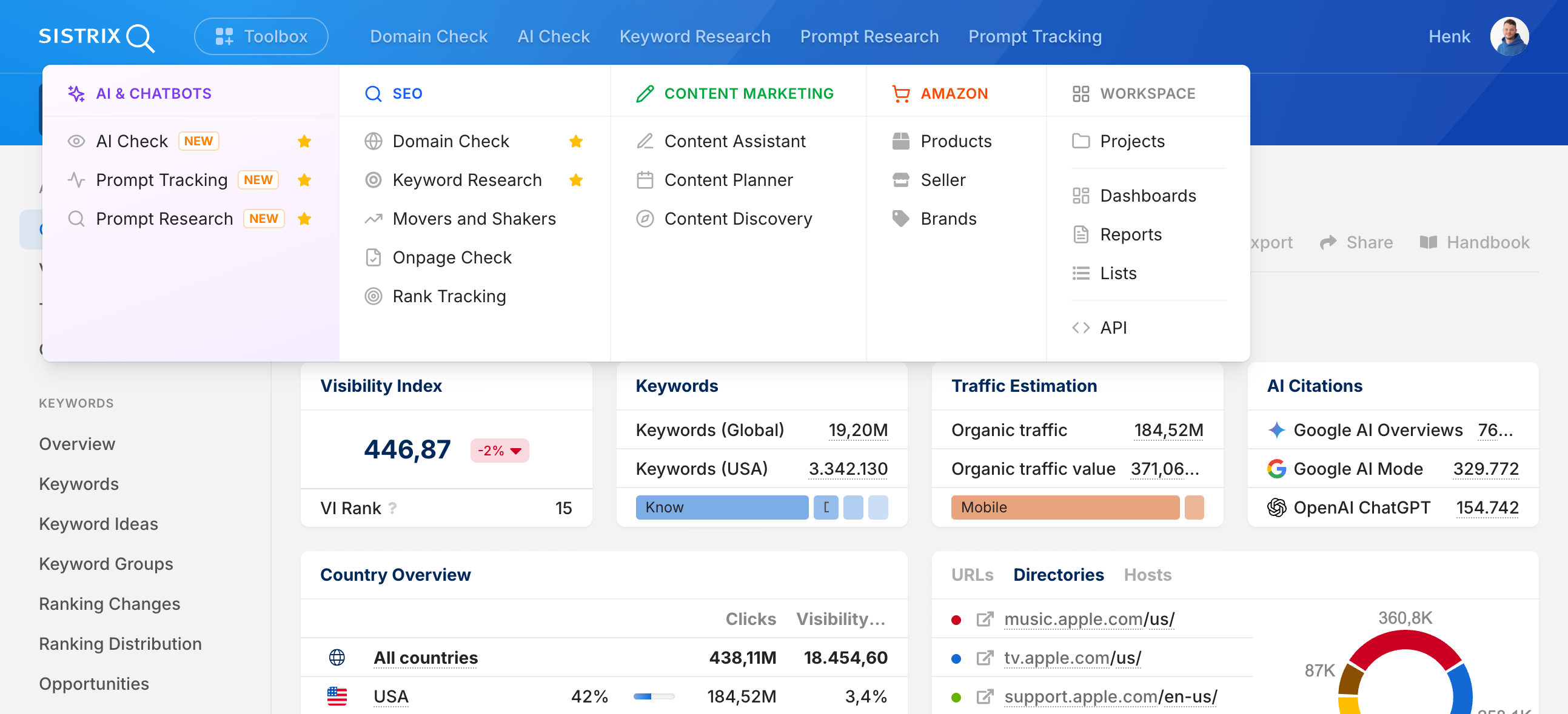
Set your own favourites
Favourites are still here: mark any feature with the star icon and it stays pinned to the top of the main navigation, in whatever order you choose. The tools you work with every day are always in view, with no detour through the menu.
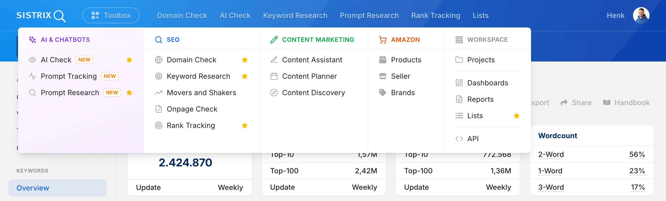
Modernised right down to the foundations: the new interface
The new navigation is the most visible part of a wider modernisation. Over the past few months, our development focus was firmly on the new AI products, and we are now bringing that momentum to the entire Toolbox.
Since the start of the year, we have been rebuilding the SISTRIX interface from the ground up. Visually, little changes at first apart from the navigation; most of the work sits under the bonnet and is technical in nature. You will notice the result above all in one place: the entire Toolbox runs noticeably faster. At the same time, the underlying system becomes easier for us to maintain: new modules and elements can be added and adjusted more easily and with fewer errors, so new features reach you faster.
Available to everyone now
The new navigation and the new interface are now live in all SISTRIX accounts. If you were still using the classic navigation, you will now be switched to the new layout automatically.
As always, we welcome your feedback at support@sistrix.com.
Enjoy exploring it!