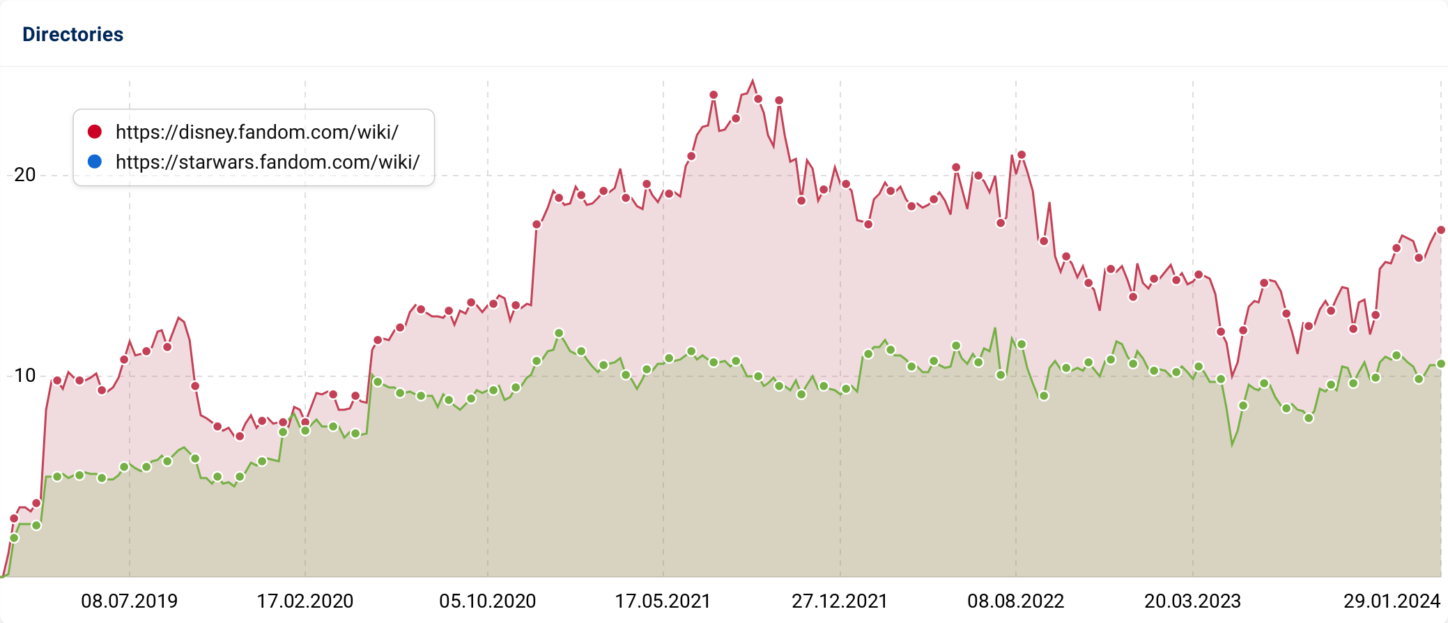
When migrating domains or when you want to analyse several directories together, it is helpful to be able to display the visibility history in a “stacked” manner. This is exactly what is now possible in SISTRIX.
If more than one visibility graphic is displayed in the charts in SISTRIX, the default setting is that each gradient starts at zero. However, sometimes a summed visibility history shows a more interesting story.
While you previously had to export the data and recreate the display in the spreadsheet of your choice, this display can now be done directly in the SISTRIX interface with one click:
In every box that displays more than one visibility history, there are now “Stacked” and “Unstacked” options, accessible via the cogwheel menu in the top right .

This makes it easier, for example, to recognize the success of migrations or to analyze the visibility of different, thematically similar directories in more detail.